
R&B’S LABRADORS OF CHEMUNG
A trusted breeder already had the reputation. The brand needed to look like it belonged to them.
R&B’s Labradors of Chemung had something many businesses spend years trying to build: a recognizable name, a long-running presence, and a deeply personal connection to the families who know their dogs.
What they did not yet have was a visual identity system that reflected that same sense of heritage, care, and permanence.
The goal was not to make the business look trendy. It was to create a brand system that felt established, unmistakably theirs, and flexible enough to work across the website, social media, print, apparel, signage, and breeder materials.
That identity then became the foundation for a complete website built around the dogs, the families, and the way R&B’s Labradors actually operates.
The starting point
The project began with several early logo concepts exploring different visual directions for the R&B Labradors identity.
Each had useful elements, but the system was still unresolved.
What needed refinement
The existing concepts included heritage lettering, Labrador imagery, circular crest ideas, and more decorative treatments. Some of those details created personality, but they also introduced unnecessary ornament and made the identity harder to reproduce consistently across different uses.
The job
The job was to identify what was worth preserving, remove what was getting in the way, and turn the strongest ideas into a coherent production-ready brand system.
REFINING THE IDENTITY
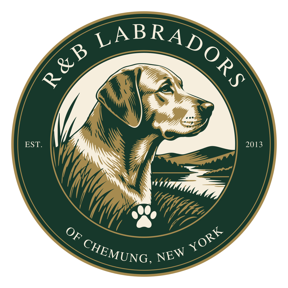
The Chemung Sporting Crest became the primary logo.
It combines a Labrador portrait with a restrained regional landscape reference, heritage serif typography, and a circular sporting-club composition that feels established without becoming overly decorative.
The final crest uses three flat brand colors: Evergreen (#17382B), Antique Gold (#A68B50), and Warm Cream (#F6EEDD).
Decorative wings and unnecessary exterior flourishes were removed, allowing the mark to end cleanly at its circular border.
That simplification made the identity feel more confident and significantly easier to reproduce across digital, print, embroidery, and signage applications.
SUPPORTING IDENTITIES
Three visual directions were developed and refined into finished identity families.
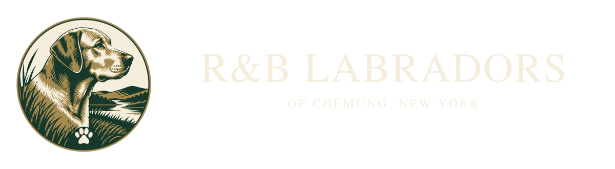
The horizontal crest lockup
The detailed crest is available when the brand has room to breathe. The horizontal configurations give the identity flexibility for wider applications without forcing the circular crest into every situation.
The Heritage Monogram
The Heritage Monogram gives the brand a more compact supporting identity. The intertwined R&B letterform, Labrador profile, and restrained gold accents create a mark that works well where the full crest would be too detailed. This became especially useful for avatars, compact placements, and secondary branding.

The Modern Estate Mark
A third direction uses a standing Labrador silhouette above a cleaner horizontal or stacked wordmark. This gives R&B’s Labradors a simpler, more contemporary option while staying inside the same visual language. The Labrador symbol was refined specifically for production use, including smoother contours, a more breed-appropriate otter tail, cleaner anatomy, and simplified interior detail.

TURNING A LOGO INTO AN ACTUAL BRAND SYSTEM
The most important part of the project was not choosing one attractive mark.
It was making sure R&B’s Labradors had a complete asset system they could actually use.
Every final vector file uses outlined artwork so printers and vendors do not need access to specific font files to reproduce the logos correctly.
The asset system was also built around consistent naming and predictable folders so the right version can be found without guessing.
- primary crest logos
- horizontal crest lockups
- stacked and horizontal secondary marks
- monogram identities
- Labrador symbols
- avatar versions
- full-color artwork
- black versions
- white versions
- reverse-color versions
- transparent PNG files
- scalable SVG masters
- production PDFs
- favicon and web icon assets
- Apple touch icon
- usage guidance
- production notes
- color specifications
A logo can look good once. A brand system has to keep working everywhere.
A VISUAL IDENTITY BUILT FOR REAL-WORLD USE
A strong identity has to survive outside the design presentation.
The final system was prepared for:
- website headers
- social profiles
- print materials
- apparel
- embroidery
- vinyl
- signage
- breeder documentation
- digital marketing
- future promotional materials
The monogram and Labrador symbol provide simpler options when space is limited.
WEBSITE DESIGN & DEVELOPMENT
Then we built the website around the business behind it.
Once the identity system was in place, the next job was giving it a proper home.
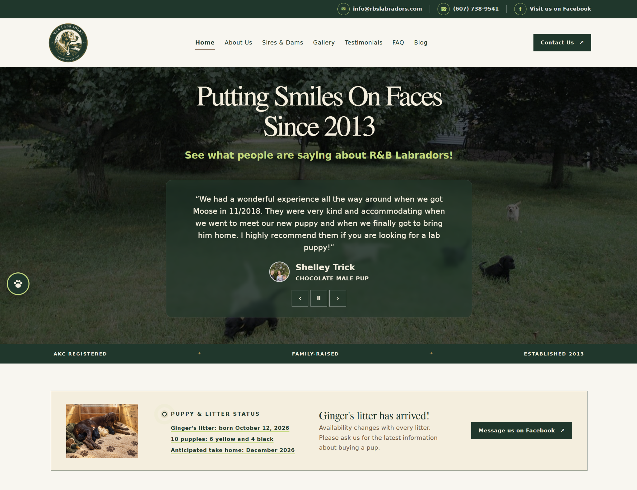
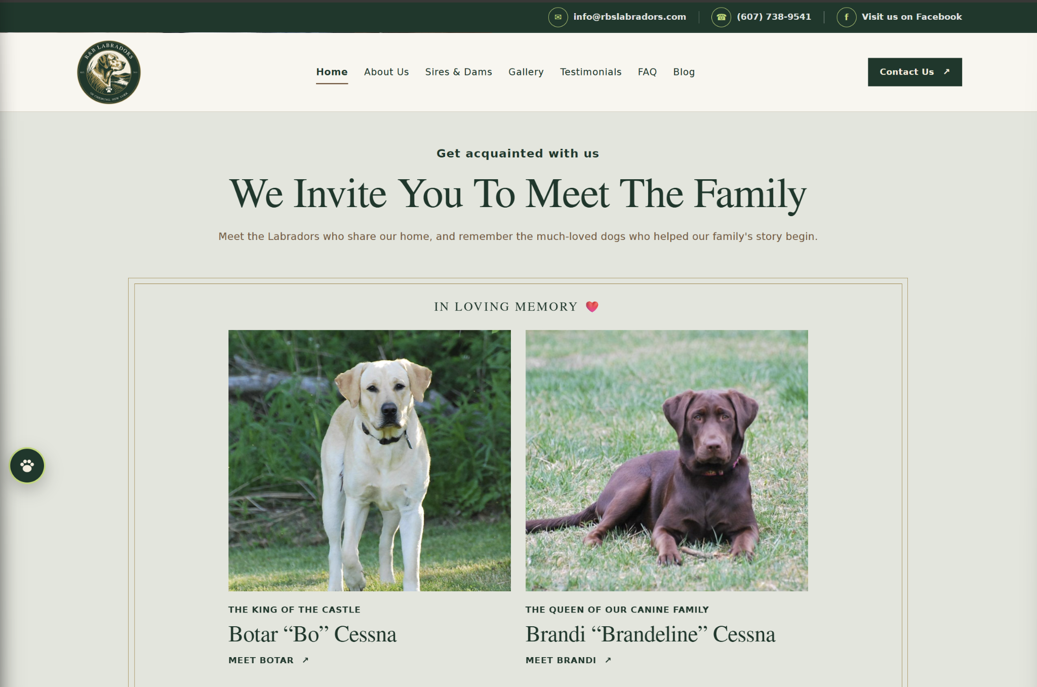
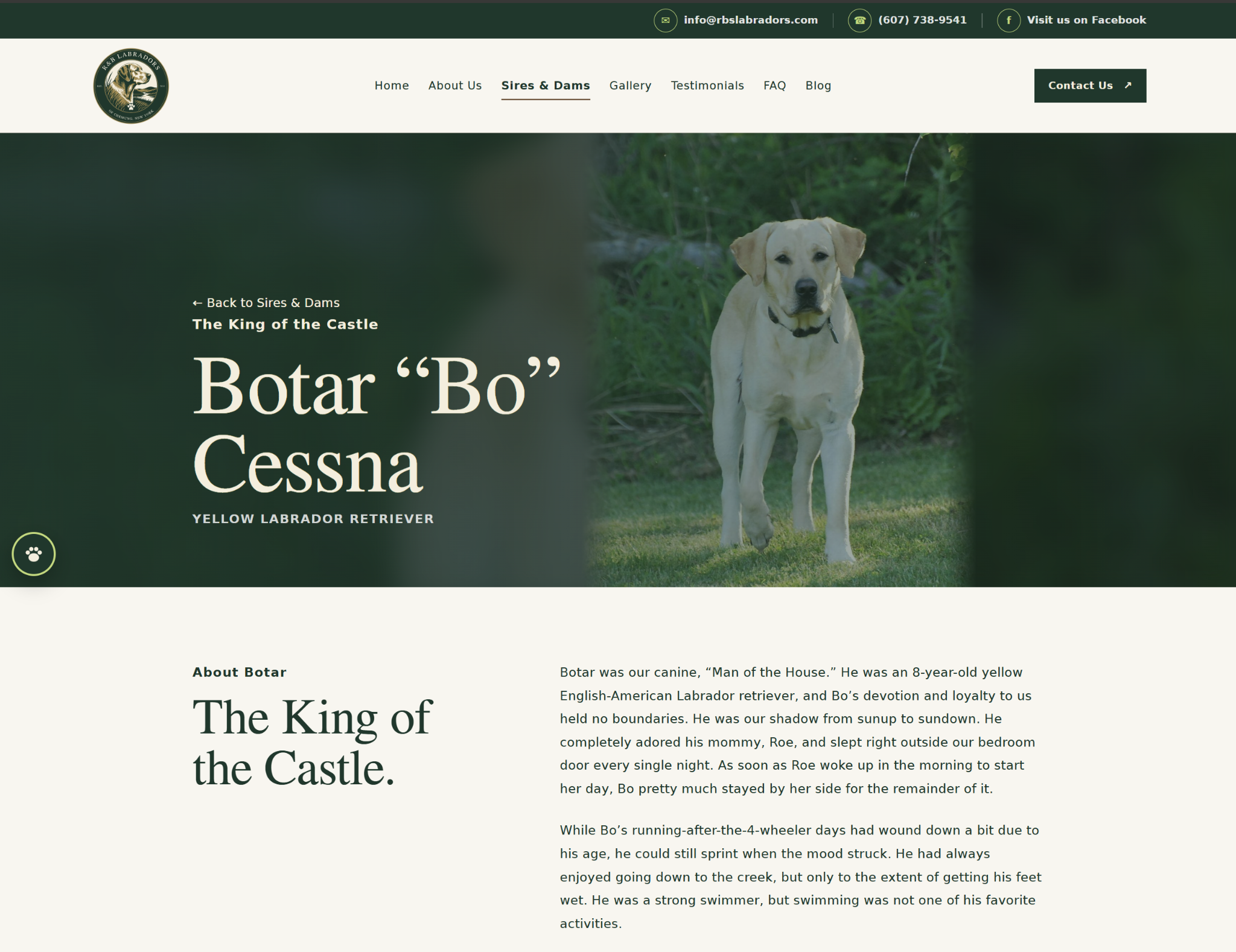
R&B’s Labradors needed more than a nice homepage. They needed a site that could introduce the dogs, explain the breeding program, share current litter information, preserve the history behind the kennel, and help prospective families find what they need without digging for it.
The finished site carries the new visual system through a full, responsive experience with clear navigation, individual dog profiles, galleries, testimonials, FAQs, blog content, and timely litter updates. It feels polished without feeling corporate, personal without looking homemade, and unmistakably theirs.
PRIMARY IDENTITY
Chemung Sporting Crest
SUPPORTING MARKS
Heritage Monogram and Modern Estate Mark
PRODUCTION COVERAGE
Vector, print, icon, and web-ready derivatives
WEBSITE EXPERIENCE
A responsive, multi-page site built around the dogs, the litters, and prospective families
THE RESULT
A brand and website that finally matched the reputation they had already built.
R&B’s Labradors did not need a completely different personality.
The finished identity keeps the warmth, heritage, and Labrador-specific character of the original concepts while removing unnecessary ornament and giving the business a clear primary mark, supporting identities, and a complete production asset library.
The result is a brand that feels more established, more deliberate, and far easier to use consistently.
That identity now carries through a complete website built to showcase the dogs, share current litter information, answer common questions, and make the business easier to understand and trust.
This project included more than logo refinement. It required decisions about hierarchy, reproducibility, file formats, production constraints, responsive use, color consistency, and how detailed artwork should simplify as the placement gets smaller.
That is the difference between a logo file and a usable identity system.
CLIENT RESULTS
Need your brand or website to catch up with the business you’ve built?
If your business already has history and recognition but the branding or website still feels inconsistent, dated, or unfinished, the right next move may not be starting over.
Sometimes the better answer is refining what already works and building the right system around it.